Wednesday, June 29, 2011

BB Couture Catalina Cutie

       For today, I have BB Couture Catalina Cutie from the California Beaches Collection. 


Catalina Cutie is a peachy-coral jelly base, packed with gold microshimmer, as well as tiny gold and green opalescent glitter.

Sunlight, no flash.

Natural light, no flash.

Sunlight, no flash.

Sunlight, no flash. 

        As a color, I think Catalina Cutie is okay. The base shade won't flatter everyone, but I do think it's cute and quite appropriate for a summer day. Of course though, my favorite part of the polish would definitely have to be the microshimmer and BB Couture's signature glitter. In sunlight, they both come to life and give the polish this warmer, more orange-y look. They aren't as visible in lower light though, which is unfortunate.
      Catalina Cutie's formula was not so good. It was overly sheer and had a weird, kind of gluey texture. It also went on pretty streaky and didn't level so nicely. After trying it a few times, I ended up with three coats of color over one layer of Essie Limo-Scene, and that turned out fairly well, although some jelliness was lost in the process. Anyway, I think I'm actually gonna put this one in the purge pile. It's nice, but I'm not...that into it, I guess.

And that's all from me today! Thanks for reading, and have a great day!! n_n

Tuesday, June 28, 2011

China Glaze Evening Seduction

  I actually can't remember the last time that I showed a proper vampy color around here, so for today, I have Evening Seduction, from China Glaze's Visions of Grandeur Collection. 

Evening Seduction is a blackened plum creme, although it looked very...brown on me. o_O


Sunlight, no flash.


Natural light, no flash.


Sunlight, no flash.


Sunlight, no flash.


Sunlight, no flash.
       
     Evening Seduction is beautiful, and I can definitely see it becoming one of the staple colors in my collection, especially come fall and winter. It features a very sexy and sophisticated shade of plum, and is one of those polishes that would flatter pretty much any skin tone. I also liked that although it looked black every now and then, I was able to tell its true color most of the time. My only hangup with Evening Seduction is that it's not a particularly unique shade. It's quite lovely, but it's also something that I feel like I've seen lots of times already. 
     I was also very impressed with the quality of Evening Seduction's formula.  It was perfectly opaque and smooth in two easy coats (which is what is in the pictures) and the dry time was good. Cleanup was hell because of the pigmentation though, so oiling your cuticles before polishing is advised. 


And that's all from me today! Have a great day, folks! n_n

* This product was provided for review

Saturday, June 25, 2011

Rescue Beauty Lounge Scrangie vs. Sally Hansen Grape Going!

        After the post about Sally Hansen Grape Going!, I received a couple of emails asking about how it compared to Rescue Beauty Lounge Scrangie. I know there have been other comparisons of these two, but I  was curious to see them side by side myself, so I put together a little comparison of my own.

L-R: RBL Scrangie, SH Grape Going!, RBL Scrangie, SH Grape Going!
Sunlight, no flash.

L-R: RBL Scrangie, SH Grape Going!, RBL Scrangie, SH Grape Going!
Sunlight, no flash.

L-R: RBL Scrangie, SH Grape Going!, RBL Scrangie, SH Grape Going!
Natural light, no flash.

L-R: RBL Scrangie, SH Grape Going!, RBL Scrangie, SH Grape Going!
Natural light, no flash.

And some closer shots:

L-R: SH Grape Going!, RBL Scrangie
Sunlight, no flash.

L-R: SH Grape Going!, RBL Scrangie
Natural light, no flash.

   Okay, so these two are not dupes and really are not even that close, so anyone owning both is perfectly justified. Like I said earlier though, I actually like the Sally Hansen better. I think it looks better on me and has a much better duochrome than Scrangie. And of course, Grape Going!'s price is much more palatable. 
    But with that said, I'm still going to keep Scrangie. It's pretty and unique (if overhyped), and I am fond of the iridescent shimmer that Scrangie has. It also has the better formula...both needed three coats before I was satisfied, but Scrangie wasn't as runny as Grape Going! and dried faster, so I can see wearing it again. 


Also, I've installed a widget at the bottom of the page that is like...a search engine for beauty professionals, and was created by betterfly.com.  I generally like to keep this space ad-free, but since it may actually be pretty useful for somebody, I'm letting this one in. 

And with that, I am all done for today! Thanks for reading and have a happy weekend!

Wednesday, June 22, 2011

Essie Lollipop

        I noticed that it's been a while since I've shown a red around here, so today, I've got Essie Lollipop, which I believe is a core collection polish. 
       
Lollipop is a cheery cherry red jelly. 

Sunlight, no flash.

Natural light, no flash.

Sunlight, no flash.

Sunlight, no flash.

Sunlight, no flash.

     I only bought Lollipop because I couldn't find Jelly Apple in the store, but I still like it. It's a bright, true, and sweet shade of red, and since it reminds me of a Jolly Rancher, I suppose it's very accurately named too. The only thing about it is that I feel like it's kind of boring-pretty, you know? Like it looks good, but it's not gonna entertain me for the day, even with the jelly finish. For that reason, I'll probably use it for my toes and continue looking for Jelly Apple for my fingers. 
     One nice thing about Lollipop though is that it has a perfect formula. I used three butter-like coats for a relatively opaque finish, and dry time wasn't too terrible. I did have to apply it over a milky base coat though, because my nails are horrifically stained in some spots (despite my efforts to remove them) and it showed up right through the red, even after multiple layers. So if you also have bad staining, that's something to consider. 

On another note, I was finally able to finish counting the entries for the Lady of the Lake giveaway this morning. The random number generator selected Kris of My Lucid Bubble fame as the winner, so a big congratulations goes to her, and much thanks goes to everyone who participated. n_n

And that's all from me today! Thanks for reading, and have a great day! ^_^

Tuesday, June 21, 2011

Sinful Colors Seaweed and Open Seas

       So as you all have almost certainly heard, Sinful Colors recently released a collection which bears an uncanny resemblance to OPI's Pirates of the Caribbean collection. I personally don't like when polish companies purposely dupe one another's stuff, but that sure didn't stop me from rolling into Rite Aid and picking up a few polishes for myself. So for today, I have Sinful Colors Seaweed and Open Seas, from the Adventure Island Collection. 
Also, I somehow forgot to take the close-up pictures for these, so mea culpa. 


Seaweed is a pale and dusty sage green creme, and is supposed to be a dupe for OPI Stranger Tides.
Sunlight, no flash.

Natural light, no flash.

Sunlight, no flash.

    Although I had my reservations about how it would look on me, I ended up really liking Seaweed. The shade of green is pretty unusual, and as a person who generally does not do well with pastels, I'm very happy with Seaweed's grungier and dingier tone. I think that the extra dose of grey and brown in there helped to soften the finish of the polish, which in turn made it much more wearable for me.


Open Seas is a  seafoam green creme with a hint of dustiness, and is supposed to be a dupe for OPI Mermaids Tears.
Sunlight, no flash. 

Natural light, no flash.

Sunlight, no flash.

       Of the two that I got, Open Seas is my favorite. It has that same grungy, dingy flavor of Seaweed (probably because of the grey), but Open Seas is brighter and more appealing to the eye. The cool shade of green is so super relaxing to look at for some reason, and it was also was surprisingly soft against my skin tone.
    
     In terms of formula, Seaweed and Open Seas were identically nice. They both went on smoothly, leveled themselves well, and required two coats for creamy perfection. My only complaint is that both colors took forever to dry and I noticed some minor bubbling for no reason.
   But little application issues (and the fact that OPI kicked Sinful's ass when it came to naming) aside, these are great for the money and would make fine alternatives for the PotC colors. I'll still have to spring for Skull and Glossbones, but I'm content to cross Stranger Tides and Mermaids Tears off my list. 

And that's all from me for today! Thanks for reading, and have a gorgeous first day of summer!! *throws sun-shaped confetti*


Monday, June 20, 2011

No Two Are Alike!

            First off, I'd like to give all of you a big hug and thank you, because The Phalanges Files reached 400 readers last night, which is...surreal to me. I'm kind of broke at the moment, so it may take a little bit of time, but I'm going to figure out something that I can do to celebrate the occasion and thank you guys.
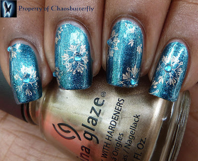
        After enjoying Milani Molten Rock on its own for a day, I wasn't in the mood to get rid of it, and decided to mess with it a little bit. Also, I took these pictures on a rather overcast day, so all the pictures are in natural light. 


I used China Glaze 2030 to stamp on the snowflake pattern from Konad plate M20. Then I put in two blue rhinestones in random sunflakes, and sealed everything up with topcoat. 


     I really really like how this turned out. But for some reason, I had a ton of trouble getting the whole snowflakes on the stamper...little chunks would just not pick up. I tested it with other paints too, but it just did not work. Maybe my plate is defective or I was scraping it wrong. But most of it got on there, so whatever, I'm happy. LOL. 

Finally, don't forget that today is the last day to enter my Lady of the Lake giveaway! It ends at 11:59 EST, so if you'd like to enter, please go sign up soon! (The graphic in the sidebar will take you to it.)
And that's all from me today! Thanks for reading, and have a great Monday! 

Sunday, June 19, 2011

Milani Molten Rock

        Happy Father's Day guys!! Unfortunately, I didn't have time to make a Father's Day mani, but I do have something that I ended up liking quite a bit. This is Milani Molten Rock, from last year's Liquid Metals Collection. 
        
Molten Rock is a saturated and rich ocean blue foil, speckled with lighter blue flecks. 

Sunlight, no flash.


Natural light, no flash.

Sunlight, no flash.


Sunlight, no flash. 

       I have no idea what molten rocks have to do with this color, but I love it alot. The light blue flecks sparkle in the sunlight, and in the shade, Molten Rock creates this pretty metallic glow. I also really like the shade of blue that they chose for this color...it's so saturated and rich, not frosty at all, and I think it would flatter a variety of skin tones. 
      The formula for Molten Rock was also really good. It was opaque in just two coats, and dried quickly. The only thing to be careful of was letting it dry well between coats or else I got some dragging, but besides that, everything was nice and easy. 

And with that, I'm all done for today!! Thanks for reading, and don't forget to be nice to all the fajahs in your life! ^_^

Saturday, June 18, 2011

A-England King Arthur

        For today, I have my last A-England Mythicals polish, King Arthur. 

King Arthur is a tungsten silver base with lots of microshimmer in it. You can't see it in this picture...maybe if you enlarge the others, you can, but the shimmer is kind of pink and green, instead of just silver. 


Sunlight, no flash.


Natural light, no flash.


Sunlight, no flash.


Sunlight, no flash.

   King Arthur is teh sex. It's so deliciously cold and industrial-looking, and made my nails look like they were encased in armor. I was also pleased by the way that King Arthur looked in sunlight. It has this really lovely metallic glint to it, and isn't dull at all. And as a bonus, it made my nails look longer and thinner. My only regret is that I don't have  talons to wear this on...then I could be like Wolverine. *sigh*
   Formula-wise, King Arthur was perfect. I used three layers for full opacity, and they went on super smoothly, with no dragging, bubbling, or other such foolishnesses. I also love how it dried pretty much brushstroke free...it helps preserve that "why yes, I do sprout metal from my fingers" look that I so yearn for. And I really do think that someone with better polishing skills than I would be able to get it perfectly smooth.

And that's all from me today! Thanks for reading! n_n